Helio Training
Brand Identity, Environmental Graphics, Graphic Design


Symbolism of the mark
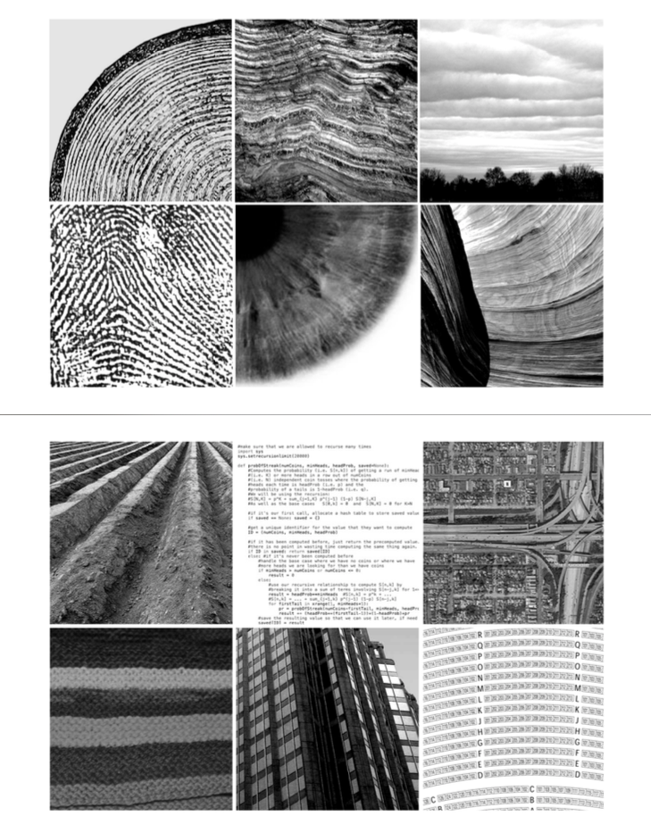
The Helio brand referenced tree rings and sediments, which symbolized accumulation of experience and strength.

additional layers of meaning
The geometry of the mark represents the student in the center, with components of knowledge being compressed inward by an outside force.


Naming
Helio means sun. Enlightenment, life, and warmth illuminating the journey.


Campus Signage
Simple, dignified, clean, credible, and a bit quirky.


SOFTWARE
Adobe Illustrator
Adobe Photoshop
Wordpress
Avada Wordpress Theme
CREDIT
Client: Helio Training
Marketing Managers: Patrick Newey, Britta Nielson, David Preece
Creative Direction: Matt Maxwell
Brand Strategy: Matt Maxwell
Art Direction and Design: Matt Maxwell
